Azotea Cantina
We never say no to tacos or margaritas. Azotea has both so when this project landed on our plate - It was a no brainer. A modern, Mexico City-inspired menu is the first of its kind in Atlanta. The menu features simple, yet delicious chef-forward food, fresh margaritas, and handcraftedcocktails. The space offers a rooftop to take in the view or chill on the ground-level patio.


LOGOS / LOCKUPS
This little lock-up is almost as tasty as their tacos.It has to work in tons of different environment so we kept it clean and crisp.We also created a version with a huge drop shadow so it pops when it needs to - A horizontal version when it’s time for a siesta.

ATLANTIC STATION / ATLANTA, GA
Atlantic Station is an upscale commercial and residential area. At its heart is the open-air mall with popular restaurants, fashion and home decor stores.

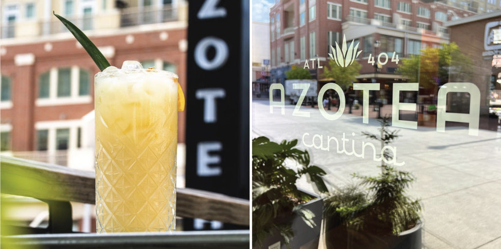


SIGNAGE
It was time for signage once we had the ID in place. We got local sign painter Chris Wright (chrismakesart.com) to grab his brushes, set up his scaffolding and get to work. Inside we utilized minimal signage but made sure that even the “Employees Must Wash Their Hands” notices were handpainted by our favorite folks at King Street Sign Painting Co. (kingstreetsignco.com)


PMS: 2310C / 2310U
CMYK: 10 / 20 / 26 / 0
RGB: 210 / 180 / 143
HEX: #D0B38E
PMS: 7545C / 7546U CMYK: 74 / 50 / 31 / 36 RGB: 60 / 66 / 71
HEX: #3D4247
PMS: Cool Gray 1C / U CMYK: 10 / 7 / 5 / 0
RGB: 235 / 233 / 233
HEX: #EAE7E7
PMS: 7416C / 7416U
CMYK: 0 / 69 / 65 / 0
RGB: 243 / 113 / 92
HEX: #F2705C
PMS: 2164C / 2164U
CMYK: 51 / 29 / 15 / 5
RGB: 115 / 142 / 163
HEX: #738EA3
COLOR PALETTE
The chosen color palette is a unique one. Rather than leading with primary colors and having the remaining palette serve as supporting colors, all 5 colors used in the K&C brand carry roughly equal weight. All five colors are used for the primary mark, and most of them are paired together to create 2-color marks.


INTERIOR & EXTERIOR
Rabe & Co was not only involved in the identity branding and touchpoints for K&C, but also played a large role in the interior design and environmental aspects of the space! We were involved with things like menus and signage, but also involved in choosing paint colors, flooring, wall materials, and furniture. We even worked with a local furniture & cabinetry design studio, Rexhill Studio, to create a custom handcrafted customer counter!
In addition to the interior work, our visual branding can be seen in multiple aspects of the exterior as well. When experiencing K&C from the outside, you'll see handcrafted signage created by a local fabrication house (literally called Fabhaus), window vinyl, sandwich boards, and hand-painted lettering on the building facade all printed / painted by local designer Pat Nunnari and his studio, Colorcube.


